(Typo)graphics > cittadellarte - Fondazione Pistoletto
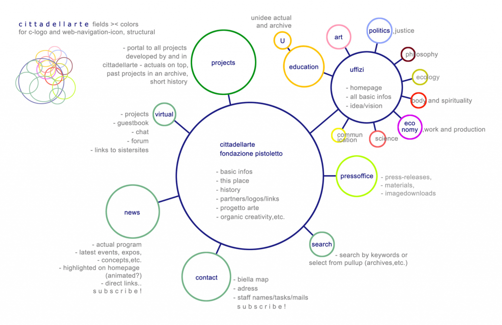
In the year 2003 the founder of cittadellarte – Fondazione Pistoletto – Michelangelo Pistoletto asked us (Teresa Alonso Novo and me) to develop a logo and a corporate identity for his world wide operational art foundation. from our close collaboration in UNIDEE, University of Ideas, which is a spatial and conceptual part of the foundation, we already knew quite well how things work there, but in order to understand better cittadellartes needs and to find the “central image” we were proposing a workshop. together with his daughter Armona Pistoletto and Marco Scattarella, a young graphic designer who worked then in cittadellarte, we took a week to elaborate what you see here.
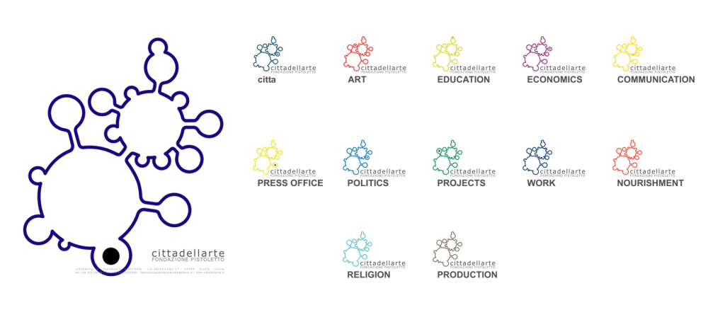
due to its complex conceptual background and organization structure we developed a logo which represents in the form of a “cellular system” its individual but highly interlinked parts. the created logo is not static but dynamic, it allows to change its color to represent one or the other office and also can extend/reduce its form by growing/shrinking if new offices within cittadellarte are opened or closed down. what we could design and outline in this week was handed over to the graphic staff of cittadellarte, but unfortunately our concept never was adopted the way the logo was suggesting it.
the same year we (Teresa Alonso Novo and me) did propose and built the logo for a retrospective on Michelangelo, which we also curated.
< IMAGES
– the result of our analysis on cittadellarte – template for the logo
– main-logo and sub-logos, which are associated to the then existing offices
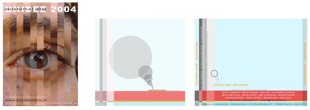
– a poster i did for UNIDEE, cover from a CD-magazine allready befor the logo for UNIDEE 2000
– More files will be added as soon as i find this f**g hard disc of these times..


