(Typo)graphics > C M Y K - AB
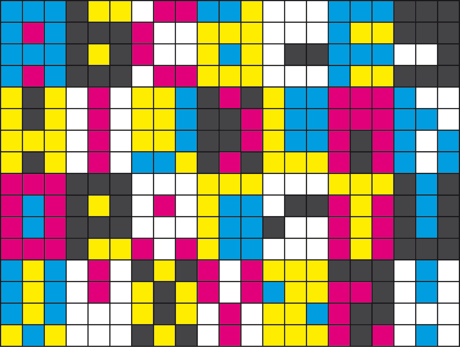
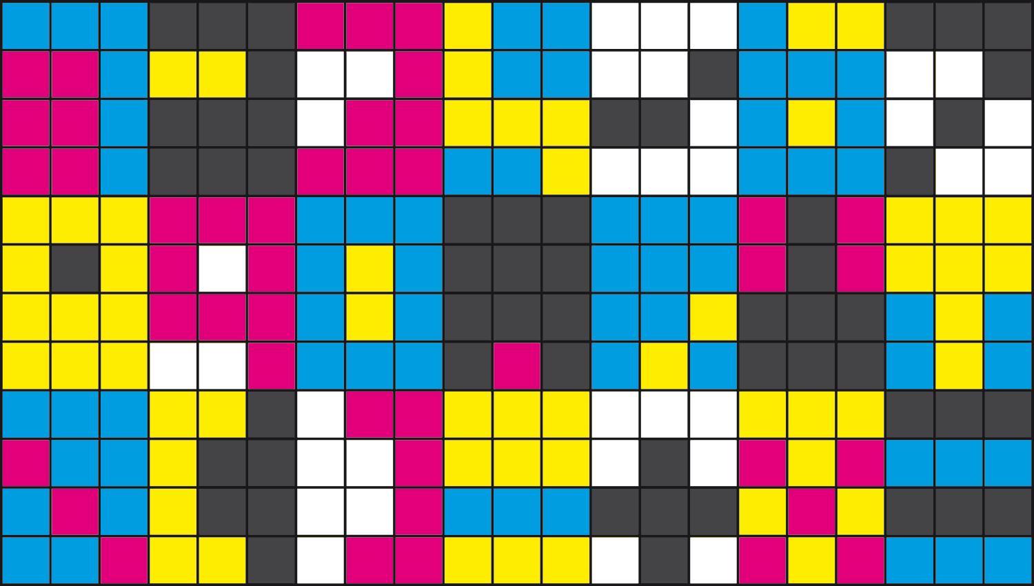
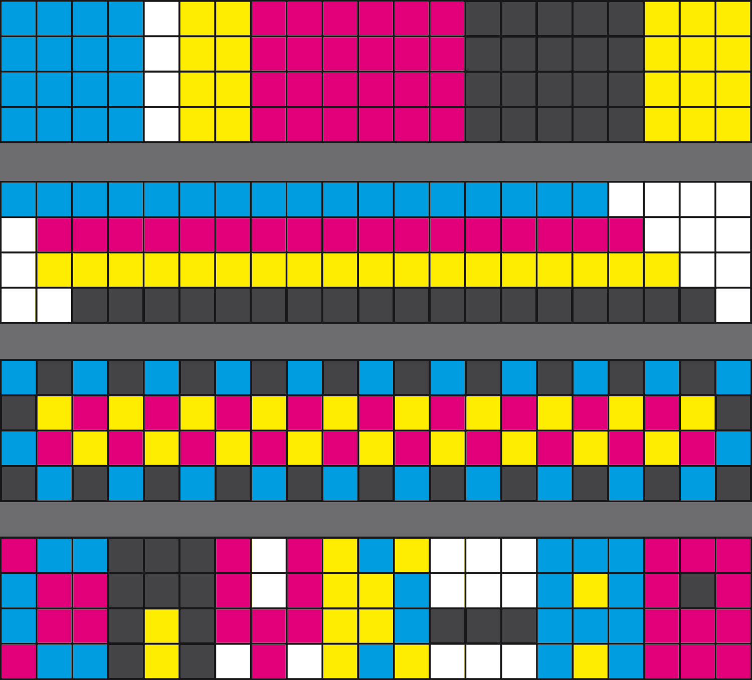
the CMYK ALPHABET, as radical as i could imagine it (3×4 fields), appeared (almost) by itself while i was working the last weeks on a huge DISPLAY. this Display i was proposing regarding a specific request from a friend who was asking me if i’m interested to create a kind of “employees-panel”. this panel we’ll develop during the upcoming year and i’ll add it here as soon as all basic questions are answered and visually outlined.. but i already want to edit this little unforeseen fruit of the working process. what i like about this typography is the play in between the analog (CMYK-print-colors) and the digital (pixel-shape) and how, due to its minimal amount of information, it looks like a code. as the alphabet is a code, just that this one is an-in-between-code. i am still working on it, so the single letters and signs still might change a bit.. anyway i want to finish it as an OTF-Headline-Fontset.
< IMAGES
– 1st board: A B C D E F G H I J K L M N O P Q R S T U V W X Y Z ? !
– 2nd board: 1 2 3 4 5 6 7 8 9 0 . , ” „ \ [ ] – + x =
– 3rd board: first vertical, horizontal, symmetrical and alphanumerical studies