(P)art > MUTTERMUSTER
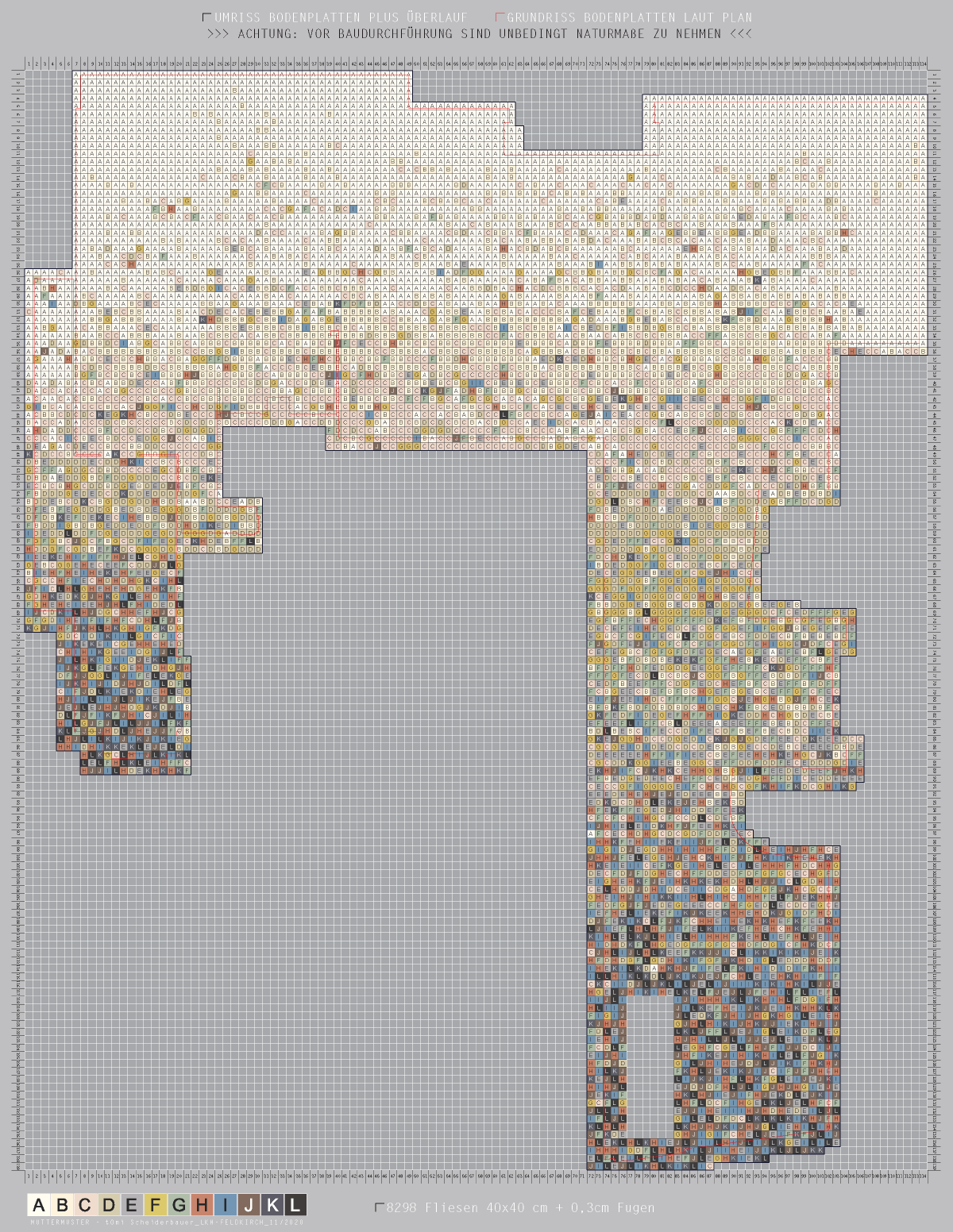
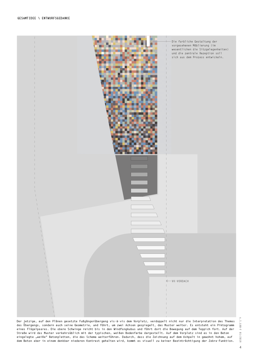
REMARK: since some things had to be shifted architecturally and the floor plan is now a different one, i had to redesign the whole ‘motherpattern’ – the first image shows the plan for the floor tiler respectively the new floor plan, all following images are the original concept (in deutsch).
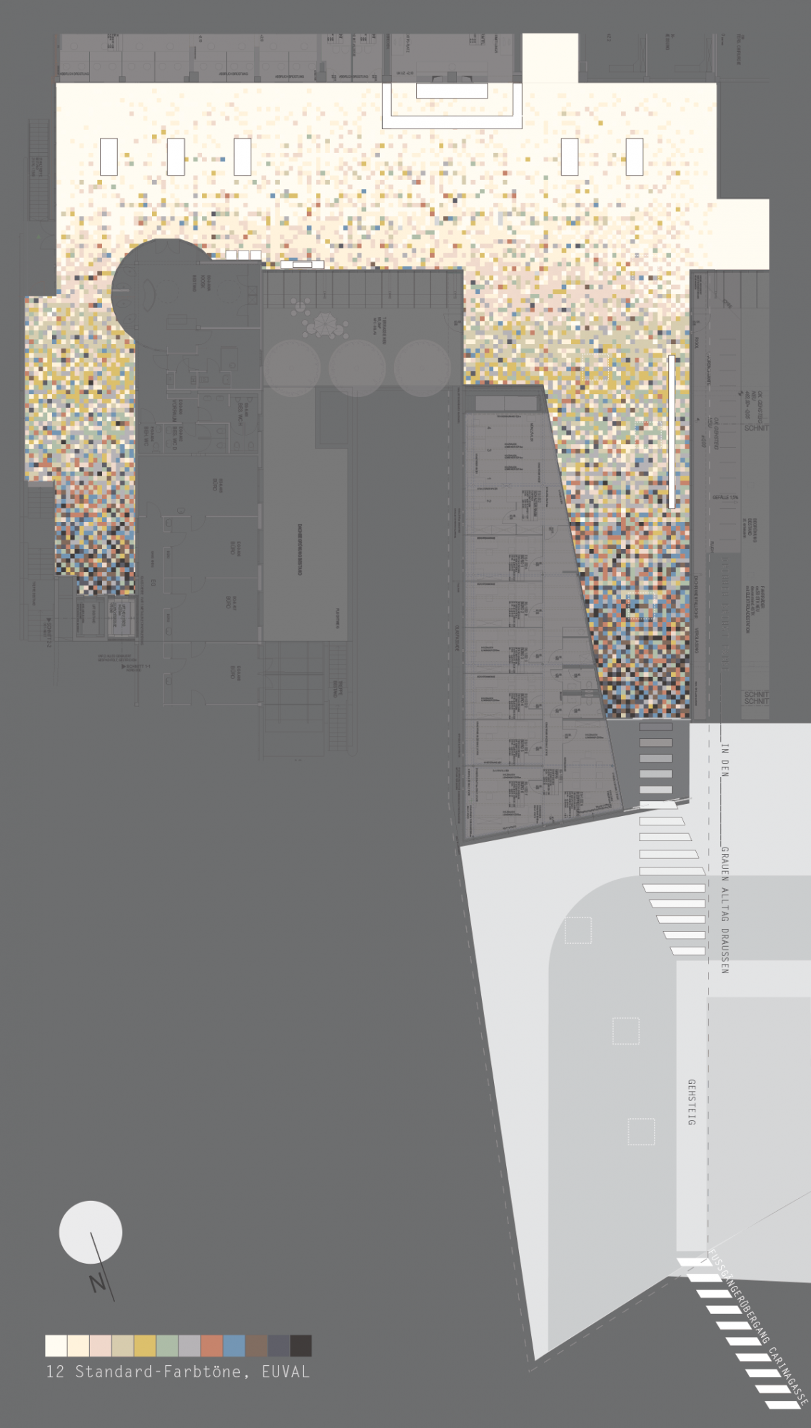
M U T T E R M U S T E R – M O T H E R P A T T E R N
..and, on the left, the original document (starting from the second graphic) that I presented to the jury in Landeskrankenhaus – Feldkirch (Central Regional Hospital – Province of Vorarlberg, Austria) at the beginning of 2019 and with which I won the competition; sorry, we won – Markus Dorner and me. Without his critical objections and feedback during the whole process it would almost certainly not have come to this result. ..so, I translated the two relevant text pages (2 and 7) in the following – if you want to read the (German) PDF on paper, please contact me directly.
Something important in advance: behind the central reception the neonatology and the maternity ward will be reinstalled in the course of the new building. This circumstance gave the project its name.
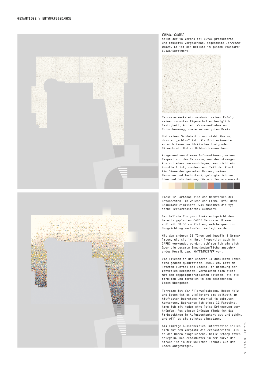
OVERALL IDEA / DESIGN IDEA
EUVAL – CARBI
is the name of the terrazzo floor produced and planned by EUVAL in Verona. It is the lightest in the standard EUVAL range: Terrazzo-Werkstein owes its success to its robust properties with regard to strength, abrasion, water absorption and slip resistance, as well as its good price. And its beauty – you can see that it is “smart”. As a child this floor always reminds me of Turkish honey or pear bread. And of screen noise.
Based on this information, my respect for the terrazzo, and the strict intention to propose something that is not an art part, but a part of art (in the sense of the whole house, its people and techniques), I came up with the idea and decision for a terrazzo mosaic.
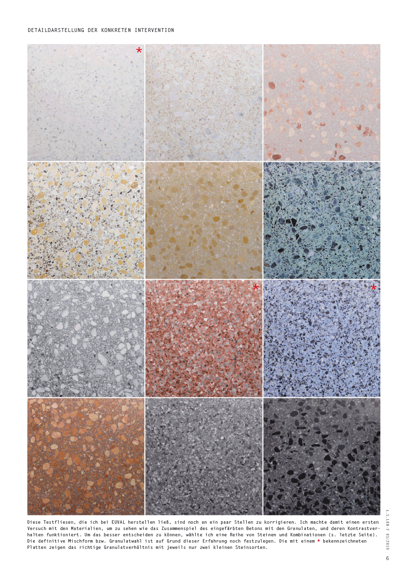
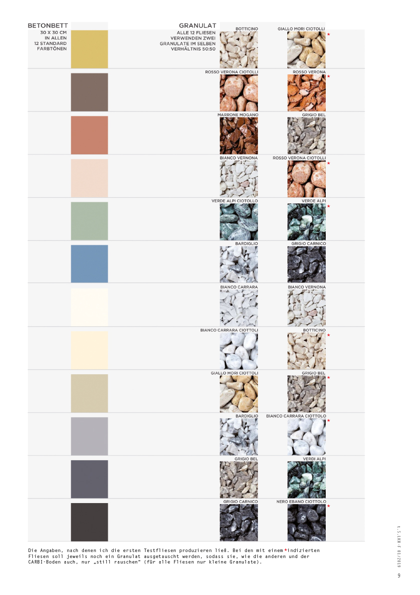
These 12 colors are the standard colors of the “concrete beds”, into which EUVAL mixes granulates, which together make the typical Terrazzo aesthetics. The brightest tone on the far left corresponds to the already planned CARBI terrazzo. This is to be equipped with 60×30 cm panels, which will the direction of the corridor. With the other 11 tones and 2 granules each, as they are also used in their proportions in CARBI, I suggest a mosaic or MUTTERMUSTER extending over the entire inner floor surface.
However, the tiles in the other 11 darker shades are square, 30×30 cm. Only in the last fifth of the floor, in the direction of the central reception, do these mix with the double-square tiles until they merge with the existing floor in color and form.
Terrazzo is the most common floor. Besides wood and concrete, it is perhaps the most frequently used material in built contexts worldwide. When I look at these 12 colors, I can associate a quiet memory with each one. For these reasons I find the color spectrum in the task context good and beautiful, and want to use it as such. As the only outdoor intervention, the zebra crossings on the forecourt, as light concrete slabs embedded in the floor, are to be mirrored. The zebra pattern in the bend of the road is applied in the usual technique to the floor.
HERE IT DOESN’T HEAL YET, HERE IT HURRIES
Coming and going, it’s swarming. 24 hours, 365 days. Always. It goes, limps, dances, trembles, rolls, shuffles, runs and races. A place of extremely moving movement. Physically and psychologically – a place between outside and inside, between fact and hope, despair and joy, worry and confidence.
An interspace, better, a TRANSITION.
The main entrance of the LKH-Feldkirch is perhaps the most incoming entrance/exit in the whole country. For many it was the first or second entrance into life, for many it is the last entry into this world.
In such a multifarious transition of movements and feelings, it made no sense for me to look for something pictorial, metaphorical – something “good doing”. Shouldn’t it rather simply go along, or accompany the passing over with a pattern that encourages the arrivals and helps them gradually to calm down? That was my final initial question and my demand on the mother pattern.
CALM DOWN. ACCEPT. PUT YOURSELF IN GOOD HANDS.
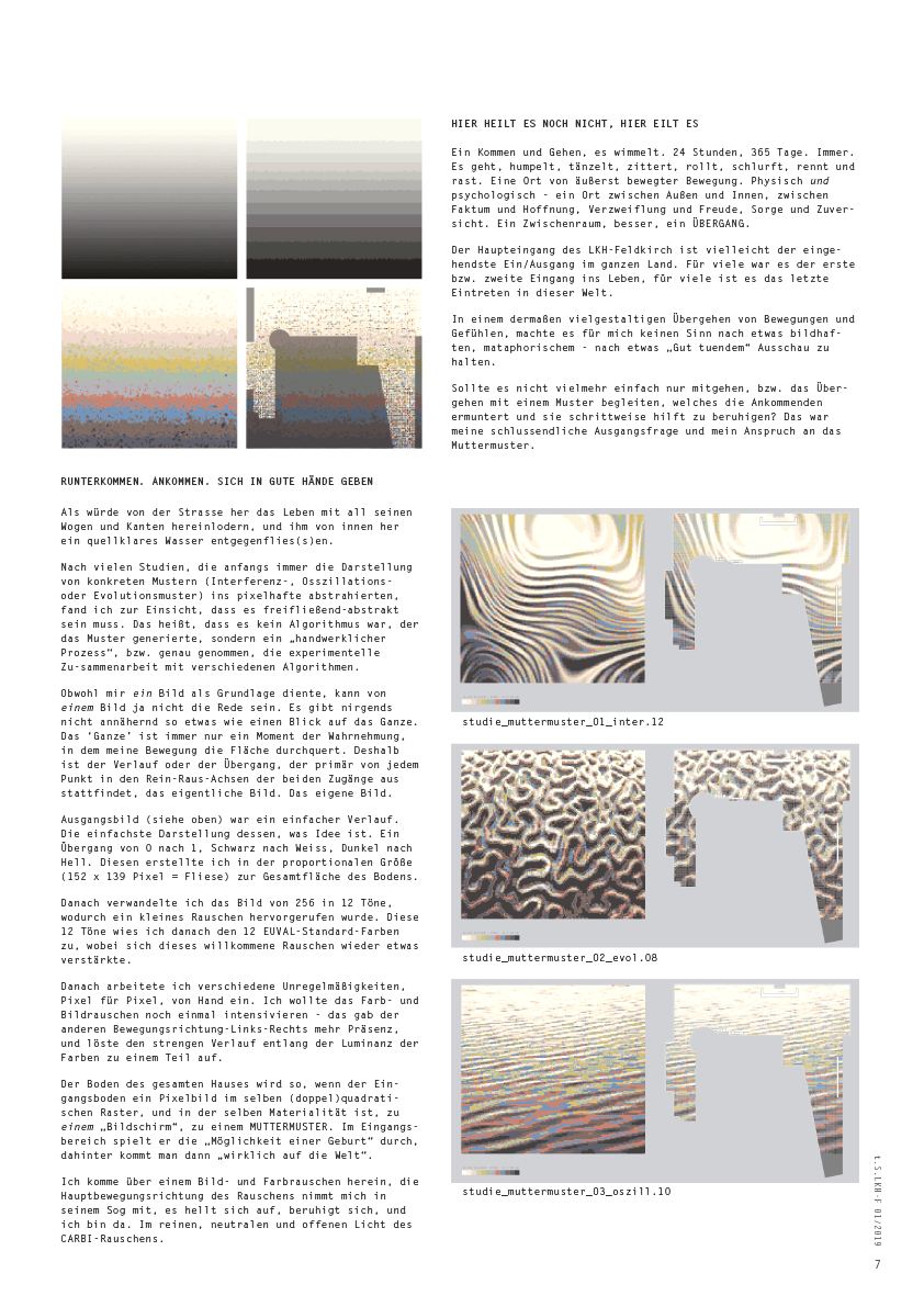
As if life with all its waves and edges was blazing in from the street, and a clear spring of water was flowing towards it from the inside. After many studies, which in the beginning always abstracted the representation of concrete patterns (interference-, oscillations- or evolution patterns) into pixel-like form, I found that it had to be free-flowing abstract. This means that it was not an algorithm that generated the pattern, but a “handcrafted Process”, or strictly speaking, the experimental cooperation with different algorithms.
Although I used an image as a basis, I can’t speak of an image, because there’s nowhere anything like a view of the whole. The ‘whole’ is always only a moment of perception, in which my movement crosses the surface. That’s why the course or transition, which primarily takes place from each point in the in/out axes of the two accesses, is the actual image. The own picture.
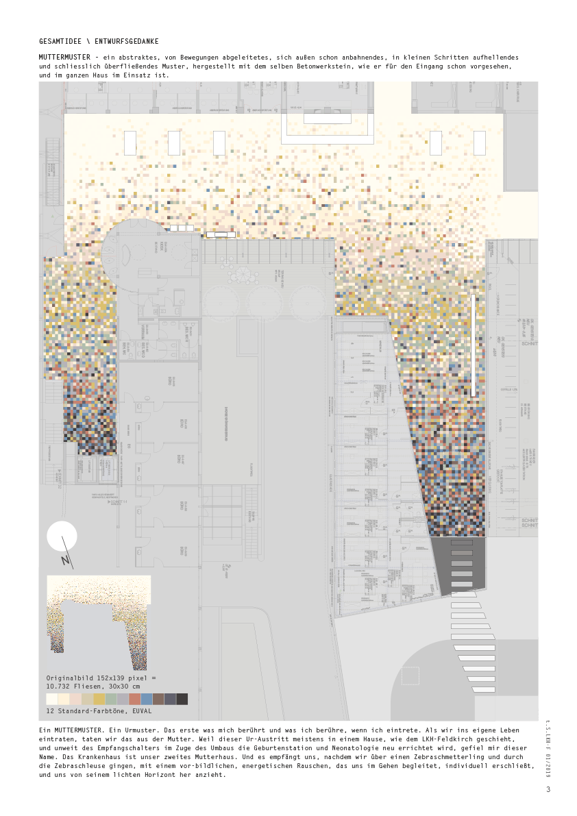
The initial image was a simple process. The simplest representation of what is idea. A transition from 0 to 1, black to white, darkness to bright. I created this in the proportional size (152 x 139 pixels = tile) to the total area of the floor. Then I converted the image from 256 to 12 tones, causing a little noise. I then assigned these 12 tones to the 12 EUVAL standard colors, whereby this welcome noise increased again somewhat. Then I worked in various irregularities, pixel by pixel, by hand. I wanted to intensify the color and image noise once again, this gave more presence to the other movement left-right, and dissolved the strict course along the luminance of the colors to some extent.
The floor of the entire house thus becomes a “screen”, a MUTTERMUSTER, when the entrance floor is a pixel image in the same (double) square grid, and in the same materiality. In the entrance area he plays through the “possibility of a birth”, behind which one is “really born”.
I come in over an image and color noise, the main direction of movement of the noise takes me in its suction, it brightens, calms down, and here I am. In the pure, neutral and open light of CARBI noise.
< new floorplan / plan for floor tiler
< overall idea / design ideas
< overall idea / overall view
< overall idea / exterior view
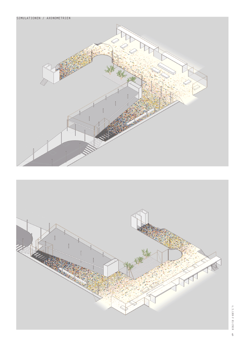
< simulations / axometries
< detailed view / standard floor plates
< reflection / 2. description
